
—FARE WELL FINE JEWELRY
A Fine Brand for a Fine Jeweler
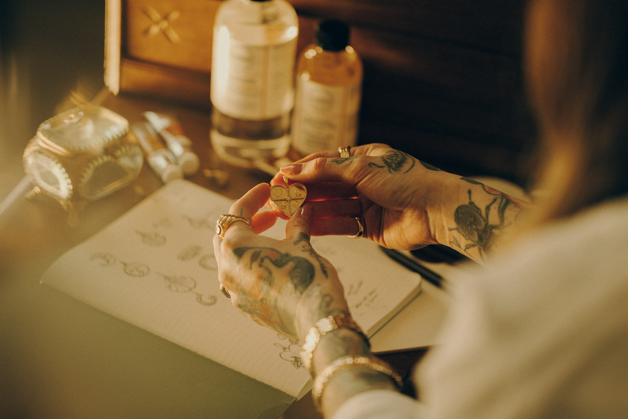
Mia is an established and well-known tattoo artist in Nashville who also moonlights as a fine jeweler and curator of vintage jewelry and wares. After building her second successful business, she reached out to give her brand a more polished presence that would create cohesion across her website and packaging.


01
BRAND STORY
Fare Well Fine Jewelry is an elegant, yet eclectic brand inspired by Mia’s tattoo artistry and unique, personal style.
02
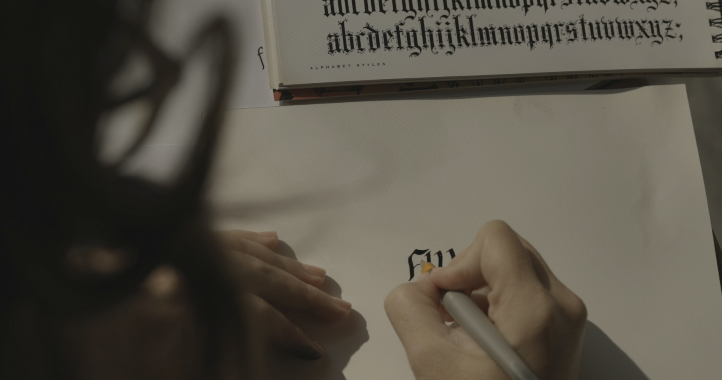
THE LOGO
The logo needed to capture the charm and beauty of the brand’s personality while still conveying a high-end jewelry brand.
Mia comes from a family of jewelers who once owned a jewelry shop in Hawai’i. To bring meaning and story into the mark, I looked to Old English Gothic letterforms that are commonly found on Hawaiian jewelry to tie back to this heritage.
Classic gothic architecture is also based on the diamond shape, which creates a nice visual connection to the jewelry itself as well as age-old tattoo-motifs and lettering styles.

As a calligrapher, I was able to hand-letter the monogram using traditional writing tools to create a custom mark embellished with a delicate diamond.

03
DESIGN ELEMENTS
The color palette was directly inspired by the pigment and hues found in tattoo art (dusty blue-greens) as well as gemstones (emeralds, rubies) and of course, beautiful gold.

It was important that we bring in Illustrations and tattoo art by Mia to add dimension and distinction to the brand.

I also studied the pattern found in the jewelry’s gold chains and jewel cuts to curate patterns that give the brand a modern edge.


Connecting back to Mia’s distinct style, the type treatments marry bold and delicate, masculine and feminine.


04
BRAND VOICE
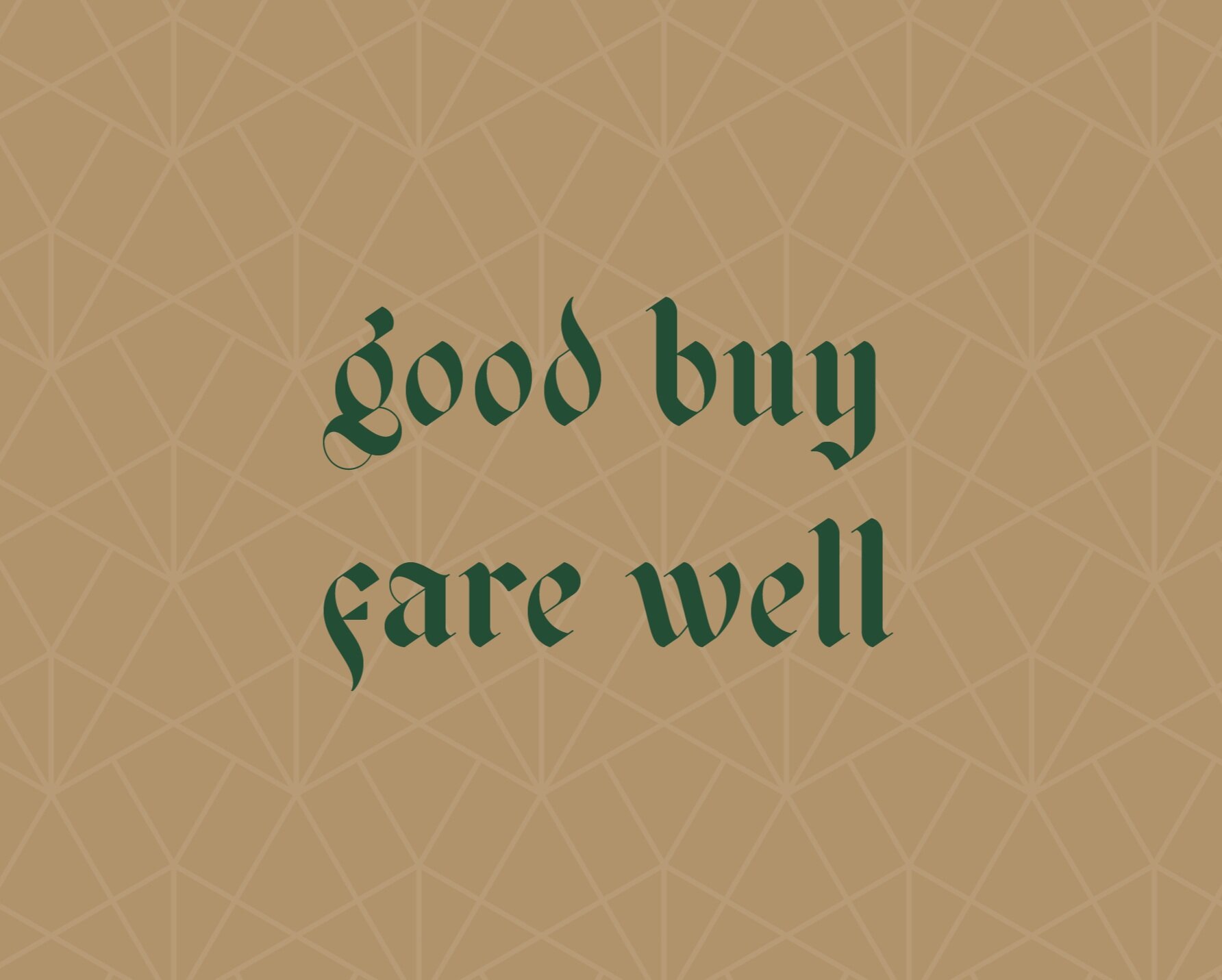
To give the brand personality, our messaging is short, sweet and sophisticated but with a playful edge.


05
BRAND ACTIVATION
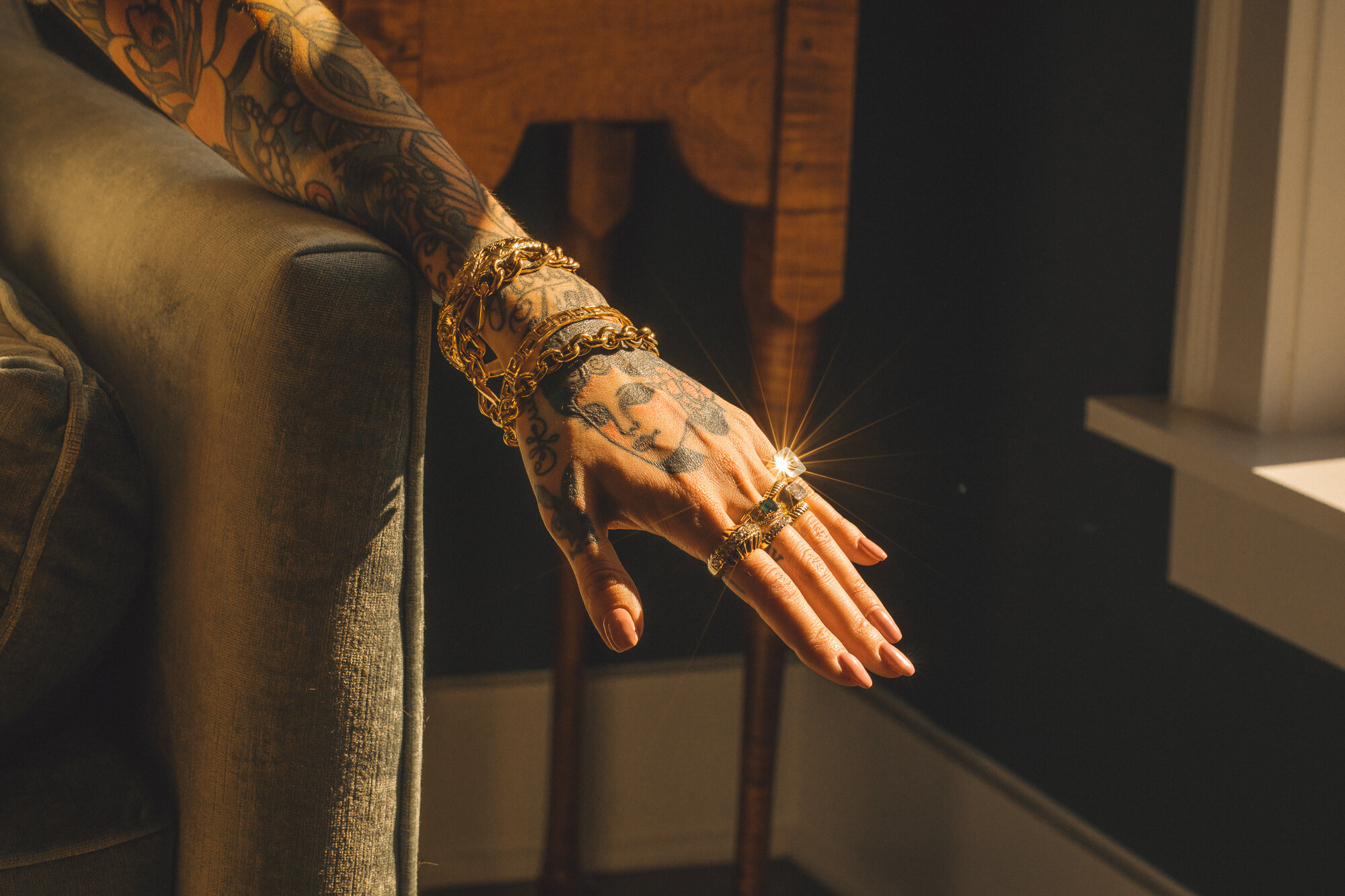
To activate the brand, photography would be most important to capture the brilliance of our product and tell a romantic, dramatic and ethereal visual story.
Playing with dramatic shadows, we worked patiently to capture the beautiful prisms and starbursts that naturally beamed off of the intricately cut diamonds and jewels (no photoshop here).


We carried these elements over to the website and packaging materials. For care cards, we added a gold foil treatment to connect back to our gold jewelry.


" Ash Branding Co. really made an amazing brand that will last me forever. I’m glad I made the investment in my business. The logo, look and feel, the color scheme, it all turned out perfectly. The website was also a real highlight. I had DIYed my website previously and honestly having a professional do it was so worth it!"
—MIA GRAFFAM
Fine Jewelry Designer + Collector