
—WELL NOURISHED NYC
Helping a New Yorker get a New Start
Rayna, a legal assistant living in Manhattan, had always dreamed of working in nutritional therapy and helping others heal, as she had years ago, using food as medicine. When Covid hit and uprooted her out of the city, she saw an opportunity to create a new life around this old dream.

01
BRAND STORY
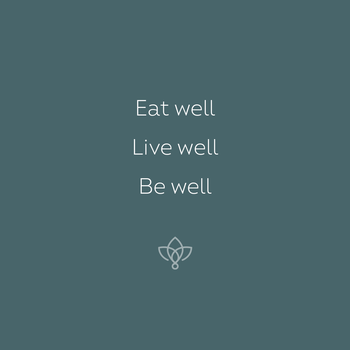
At Well Nourished, we believe in the power of food to heal and nourish—mind, body and soul. Simply put, our motto is eat well, be well.
02
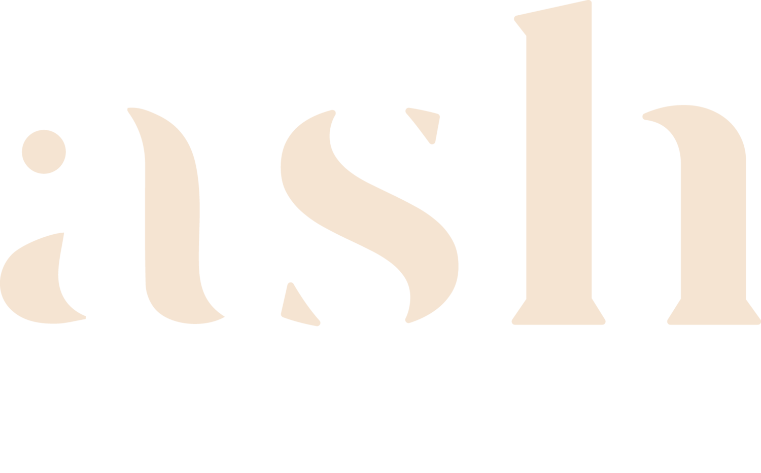
THE LOGO
Well Nourished NYC is a fairly long name and so we first focused on how we could stack the typography in a way that was functional—maximizing legibility and horizontal and vertical space. This included nesting the logoicon so that it sprouts from the “i” replacing the dot, or tittle.
The icon captures the three key elements of the brand: 1) the mind-body connection, 2) plant-based nutrition and 3) the transformation and healing that occurs when all are working together in harmony.

The result is a unique mark that could be used as a standalone icon, but also a flexible logo structure that Rayna can grow into and eventually use to sub-brand other aspects of her business and brand.


03
DESIGN ELEMENTS
While the logo leads with green to create an immediate connection to food and healthy nutrition, the full color palette rounds out the brand with warm tones and earthy neutrals to match Rayna’s warm, nurturing personality and feminine style.

The icon system uses a linear style that matches the line-weight of the logoicon.
A unique pattern created by the logoicon adds some visual texture to the brand.

The all lowercase letterforms help the brand feel approachable and human. Intro—a modern san serif with its classic embellishments—brings movement and personality, while handwritten accents will create a personal feel.


04
BRAND VOICE
Ultra-simple messaging played on the word “well” in the name—get well, live well, well done—and inspired our motto “eat well, be well.”

Custom instagram photoshop templates allowed Rayna to curate quotes, nutrition tips and promotions. After only a quick 1-hr virtual training session, Rayna was able to create branded graphics all on her own.


05
BRAND ACTIVATION
We used the logoicon to create a gold pendant that Rayna could use as a welcome gift for new clients. This helps create a sense of community and belonging as well as help clients stay connected to their wellness journey and intentions.

We printed business cards on seeded plantable paper that would allow clients to grow their own basil or wildflower—reinforcing our brand’s message of growth, nourishment and our natural, holistic approach to health.

We worked to apply Rayna’s brand to her client’s full experience—from DIY stationery to intake forms, signage and her nutrition session presentation and customized models.


“Ashley has been a true life saver for my business. I had no idea how little I actually knew about branding and the importance of it. I learned so much along the way and had amazing support to boost my confidence. The whole experience pushed me out of my comfort zone for the better. It allowed me to become more comfortable doing things I was not previously, including posting on social media and being in front of the camera. To be honest I am still getting comfortable with it, but I would have never started had it not been for Ashley cheering me on along the way.”
—RAYNA COSTANZO
Functional Nutrition Therapist