
—ALOHA LEI SHOP
Old Hawai'i Meets Modern-day Maker
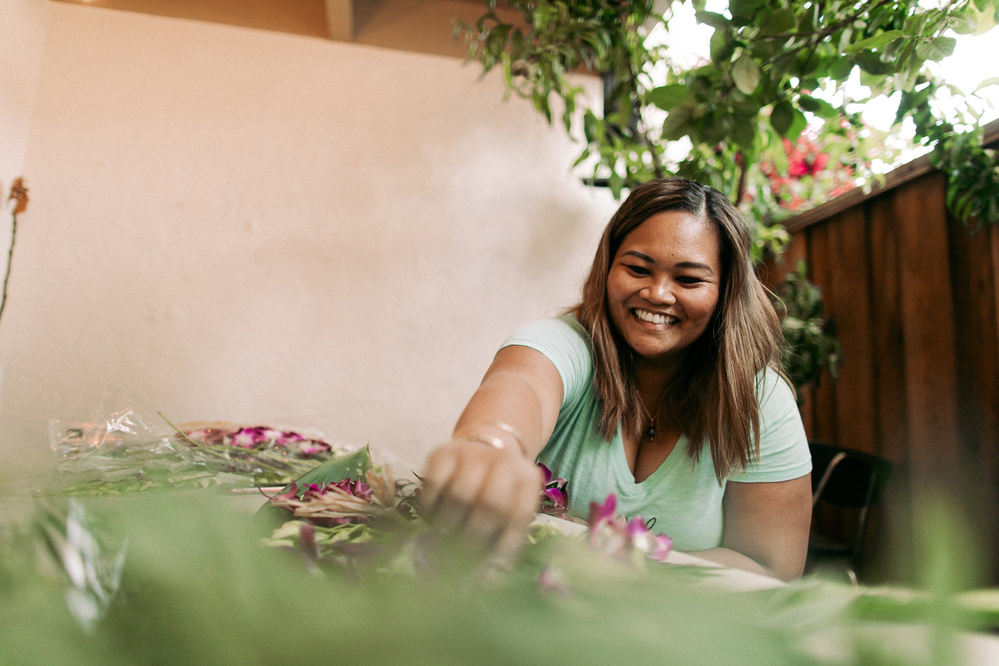
Hawai’i-born mom of two and preschool teacher, Gesmyne, started making lei and hakus in the Bay area to support her growing family. She asked for help to get her fledgling side hustle off the ground, and soon after Aloha Lei Shop was born.

01
BRAND STORY
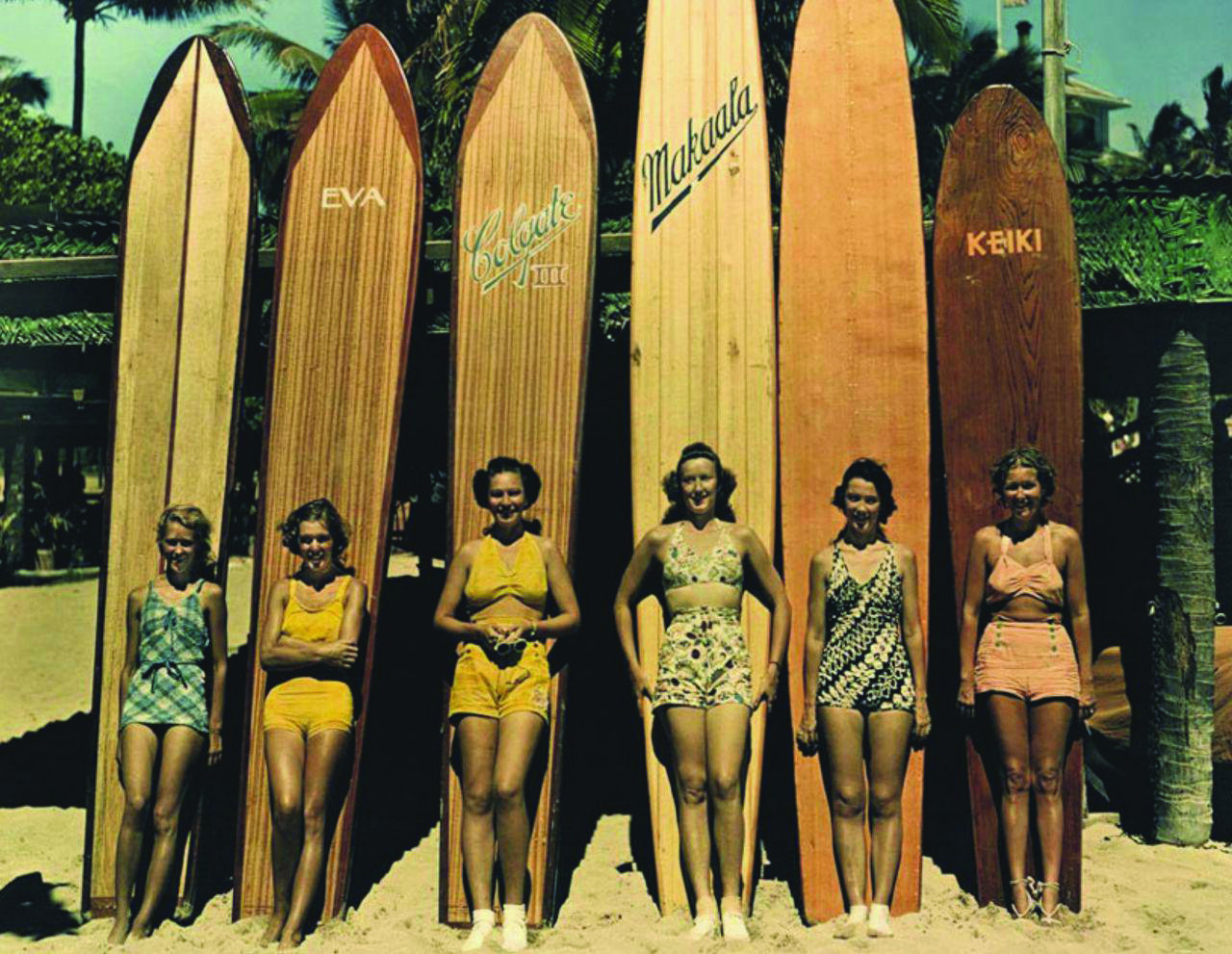
The Aloha Lei Shop brand brings back the nostalgia of old Hawai’i, evoking the charm and romanticism of a simpler time.

02
THE LOGO
While I might’ve normally created custom lettering for a bigger brand, for this project I wanted to find something more readily available, user-friendly and affordable. Good type design can be really pricey (and rightfully so because of all the work that goes into it).
I was very naturally inspired by the lettering in vintage signs I grew up with in Hawai’i. There is a romantic and timeless quality about them that is so embedded in the islands but also reflected in the tradition of aloha and lei-giving.
I found an awesome (and affordable) hand-lettered script and sans-serif typeface (created by one of my favorite lettering artists, Ian Barnard) from Creative Market. The pairing of this type with a retro, beach-y color palette gave the brand a lot of personality. We paired it with illustrations to create one-of-a-kind badges featuring hawaiian phrases, words and other branded graphics.
03
DESIGN ELEMENTS


04
BRAND VOICE
We created a library of branded posts so that Gesmyne could easily update and manage her instagram.

05
BRAND ACTIVATION
With a small budget, my go-to approach to packaging is to find ready-made containers and boxes that we can easily add logo stickers or stamp by hand. We created a few stamps that Gesmyne could use on shipping boxes, stationery and really anything she needed as her products changed and expanded.

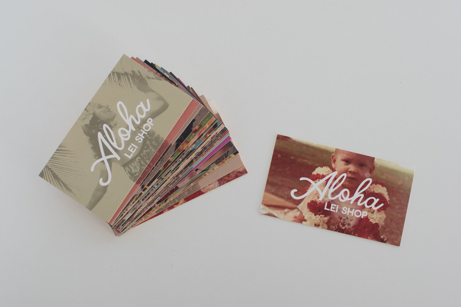
We used Moo to create variable back business cards that featured old photos of her family wearing lei at graduations or childhood events. This brought a personal element to the retro brand. We picked a yellow seam for Moo’s Luxe Cards which made the cards appear aged and vintage.


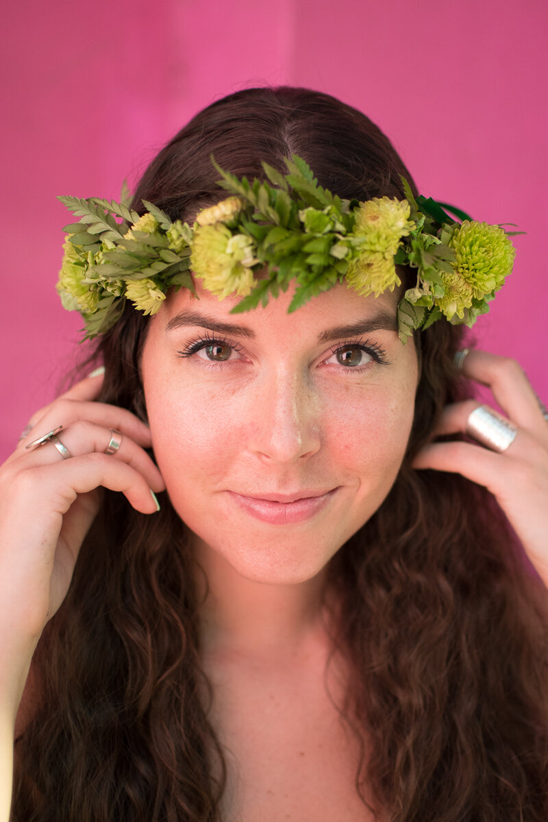
We made sure to grab b-roll while doing product photoshoots so that we could create small bites of content for the website and social media. To capture the colorful, vintage personality of the brand, we sought out distressed painted walls throughout the city for our backdrops. And of course, branding on a budget, we had friends (or ourselves) model the product for us.


For Gesmyne’s first maker’s market booth, we handpainted the logo on a distressed wood backdrop and got creative with signage and lights for the night market and live music festival.


We went with a Squarespace website so that Gesmyne could sell her lei’s online to customers in the Bay Area and across the country, but also update her own website easily as she grew.


“After working with Ashley I realized that a brand is so much more than a logo. She helped take my vision beyond what I could’ve even imagined for myself.”
—GESMYNE BELL
Lei Maker and Mom of Two