—SKYLINE LASER
Sky's the Limit for this Sign Shop
For more than 25 years, Emily has been working alongside her dad and brother in their family-owned business Skyline Laser—handmaking custom signs for small businesses out of Malvern, Pennsylvania. As her small business grew on Etsy and into a larger facility, she reached out for a rebrand that could reflect everything they had built over the past two decades while also paving the way for their future.

01
BRAND STORY
This retro-inspired identity connects to the family’s roots while harkening back to simpler times when things were made by hand and with heart.
02
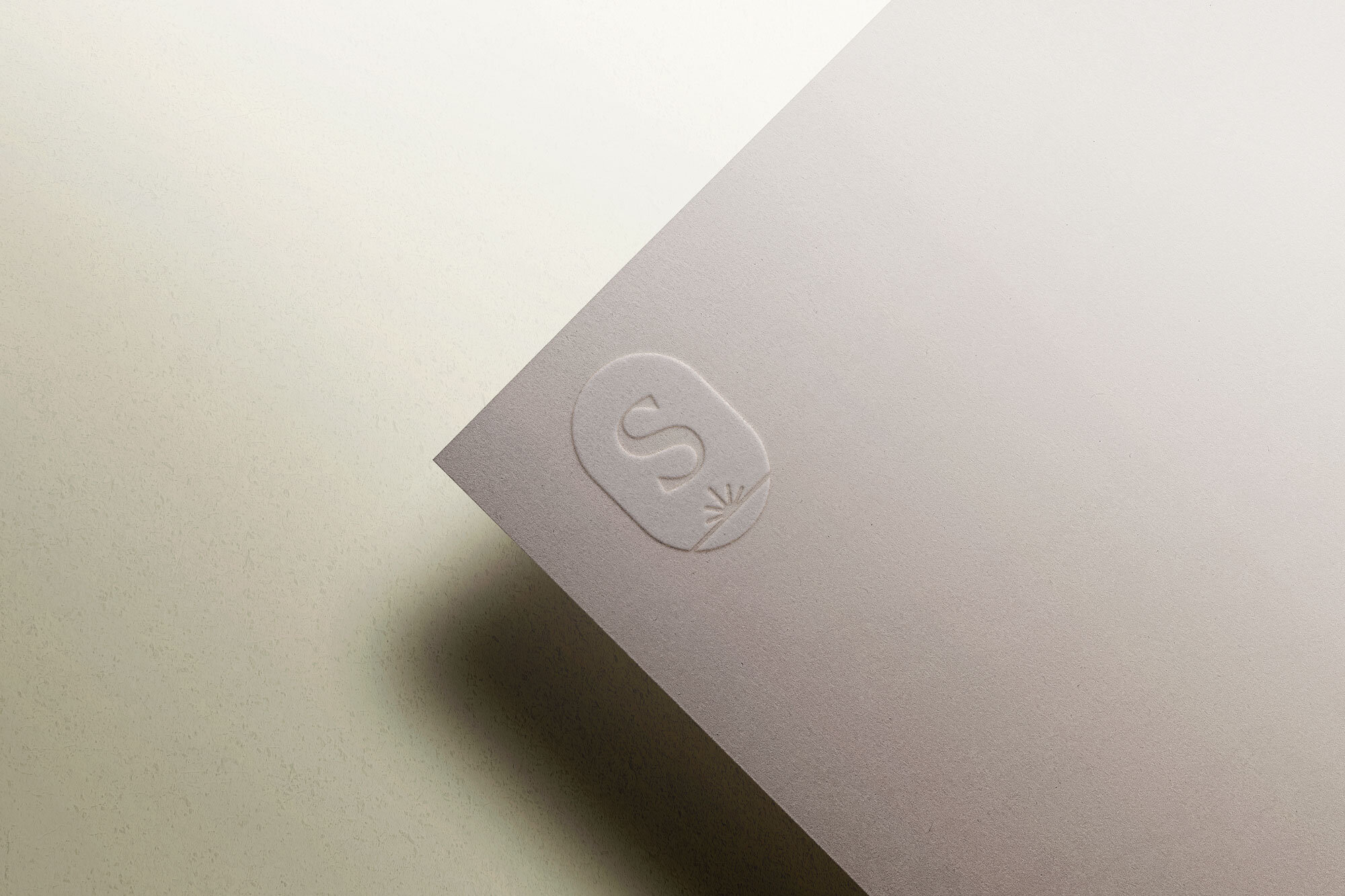
THE LOGO
While we wanted to honor the history and homegrown feel of the family business, one of Emily’s goals for the brand was for it to be more polished and professional.
Since the logo is the first entryway into the brand, it was important that it balance personality with modernity to convey trust.
The retro-inspired typeface provides a lot of visual interest and organic movement while still maintaining structure, legibility and clean lines. The resulting mark is both friendly and human yet professional.
To bring meaning into the mark and the brand, we looked to the name Skyline and the laser itself. Rather perfectly, both shared a similar visual architecture. The vantage point from which the embedded icon is drawn allows us to imply both the horizon line where the sky meets the ground (where dreams become real) and the laser beam itself.

03
DESIGN ELEMENTS
A vintage color palette of dusty hues, earthy neutrals and bright accents were inspired by the family’s 70’s-era decor.

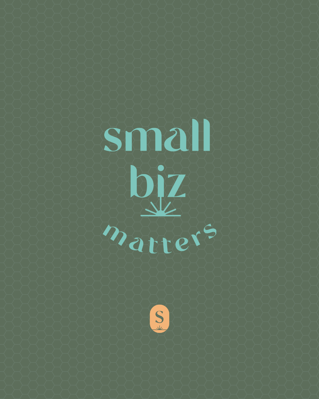
Retro geometric patterns create motifs for the brand that connect to the laser (hexagon grid along which the laser moves), the era (S-curve widely used in 70’s graphics) and the name (sunrays seen at the skyline).

The sunray icon in the logomark can also be used on its own as a design element and is complemented by line-based icon system.


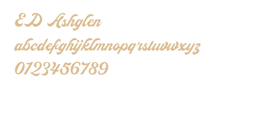
Type is one of the cornerstones of the brand. Used to create scroll-stopping graphics, type creates a visual language that distinguishes Skyline in the saturated marketplace of signmakers.


04
BRAND VOICE
We crafted custom messaging that spoke to the family’s small business values and story.


05
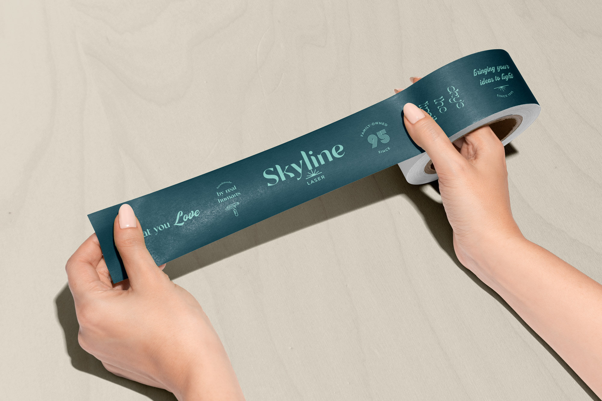
BRAND ACTIVATION
To bring the brand into the packaging of the custom signs without driving up costs, so we created custom packaging tape that used the typographic elements to tell the story of the business and its values.

To activate the brand and logo, the business and thank you cards featured a laser cut element integrated into both the back and front of the cards.


"I am blown away by my experience with Ash Branding Co. I went into the process looking for a brand refresh, and came away with so much more. Working with Ash, we uncovered my brand story—which I thought I knew before hand, but she made me dig deeper and articulate our story better than I ever could have on my own. Finding our brand story gave clarity, inspiration, and motivation for all other aspects of my business.
Ash not only provides stunning visual designs for your brand, but also thoughts and ideas that will help your business grow. She is extremely thoughtful, communicative, and organized. All of your questions will be answered before you're able to ask them.
I received so much more from my brand refresh than I expected. It was a truly invaluable experience."
—EMILY RUGH
Owner and Sign Artist