

—LAWRENCE LOVESTOCK
A New Look for an Old Family Farm
Tucked away against the Ko’olau mountains in Kahalu’u on the island of Oahu is a small rescue farm started by the Lawrence family. They coined their growing brood Lawrence Lovestock, because unlike livestock that feeds the body, their animals are called lovestock because they feed the soul.
Dating as far back as 1917, six generations of their family lived and raised their families on this land and so the brand we created really needed to honor the legacy and spirit of this majestic place—past, present and future.


01
BRAND STORY
The Lawrence Lovestock brand honors their rich tradition of ohana, family-first and family-owned, kuleana—care and respect for the land and the animals and aloha—sharing with others.
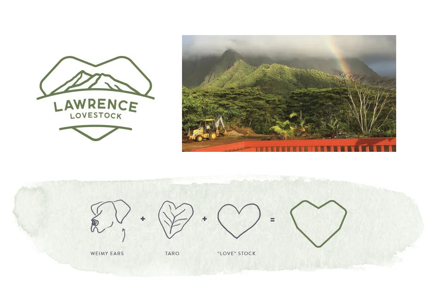
02
THE LOGO
To represent the family, the Lawrence name is the cornerstone of the logo. The most iconic feature of the land—the Ko’olau mountains—are hand-drawn from the actual ranges seen from the farm and designed within a one-of-a-kind heart shape that emphasizes the “love” in the name but also a subtle nod to family motifs—taro (the generations before raised taro) and Weimaraners (a beloved animal of the current generation).
The clean lines and style of the mark was designed to be legible on environmental signage, apparel, stamps and in various applications.


03
DESIGN ELEMENTS
The color palette picks from the earthy tones unique to Kahalu’u (from land to sea) and the warm, rustic, wholesome and grounded personality of the brand and the farm.

Custom line icons create friendly characters for all the animals to be used in group tours or stickers for keiki.
Imagery is lush, colorful and features the iconic scenery that surrounds the farm while capturing the joy and love that the animals bring to the family and visitors.


The humanist typeface chosen is friendly and approachable for a family farm.

04
BRAND VOICE
Copy on the website was written to feel simple, approachable and warm—with headlines like, From our family to yours or Lend a hand, on our land.


05
BRAND ACTIVATION
With a small budget, we opted for a Squarespace site that the family could easily edit and where visitors could learn more about the family’s history, book experiences, donate and volunteer. To create community, the family used their logo to create branded t-shirts water bottles and packaging for their farm-fresh eggs.


“Ashley took the time to listen to my thoughts and ideas (that were scattered!). It was magical to see the end result. We get so many compliments and are very proud of our logo and website. It went above and beyond my expectations. Had I kept Ashley in a box and insisted on what I was imagining she would have never created the logo that will last us a lifetime.”
—DENISE LAWRENCE
Family farm owner and rescue animal lover