—DANIEL LIM, MD
A Legacy Brand for a Local Doctor
Daniel, an orthopedic surgeon born in Honolulu, Hawai’i, recently returned to the islands to start his practice in the community he grew up in and once again called home.


01
BRAND STORY
The Lim Orthopedics brand connects to Daniel’s local roots but also his family’s legacy to create an experience grounded in community, compassion and personalized care.
02
THE LOGO
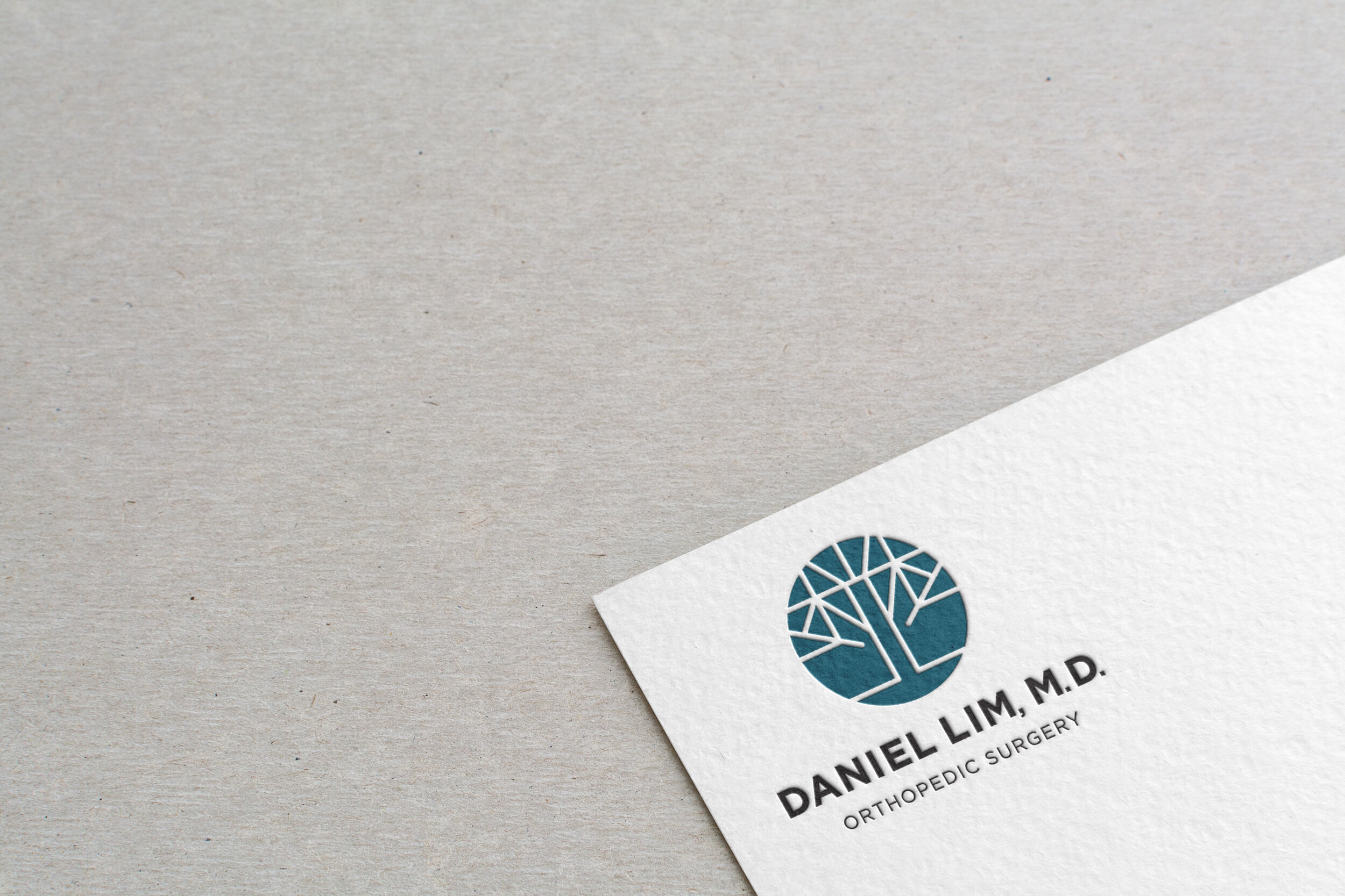
Daniel’s Chinese name, given to him by his grandfather, translates to “Long Root” and his family name, Lim, is drawn as two trees sitting next to each other (林). As the first Lim born in the States, it is a symbol of a strong foundation, the rooting of his family in a new community here in Hawai’i. Interestingly, the tree is also a hundred-year-old symbol for orthopedics originating with the Andy tree, a bent tree braced to a stake to make it grow upward and straight.
Inspired by these connections, I created a logoicon that captured this symbolism to beocme a unique mark for Daniel. The clean lines that make up the tree are modern and balanced while drawn intentionally straight as a nod to orthopedics—“ortho” meaning straight. The tree is nested in a circle, as circles are universally positive symbols of community, unity, and protection. They convey feelings of balance, wholeness and comfort while creating a soft contrast to the straight geometric linework of the tree and bold, grounded typeface. The stamp-like style of mark is also a nod to a Chinese name seal.

The mark was especially designed to be used as a standalone identifier that could work well in both digital and printed formats, from app icons to stationery seals.
03
DESIGN ELEMENTS
Cool hues ground our color palette. Blue is the color of the sky and the sea. Naturally calming, these hues evoke feelings of trust, stability, confidence, tranquility and truth—an appropriate color to comfort patients. The teal tint connects to the parent brand of Daniel’s orthopedic practice and earthy neutrals connect to his home-grown, grounded personality. A few bright accents give the brand energy and a modern style.

A library of health and sports icons with the same linework seen in the logo was created for Daniel to use in presentations and on social media. The type selected is minimal, humanist and highly legible for patients of all ages.
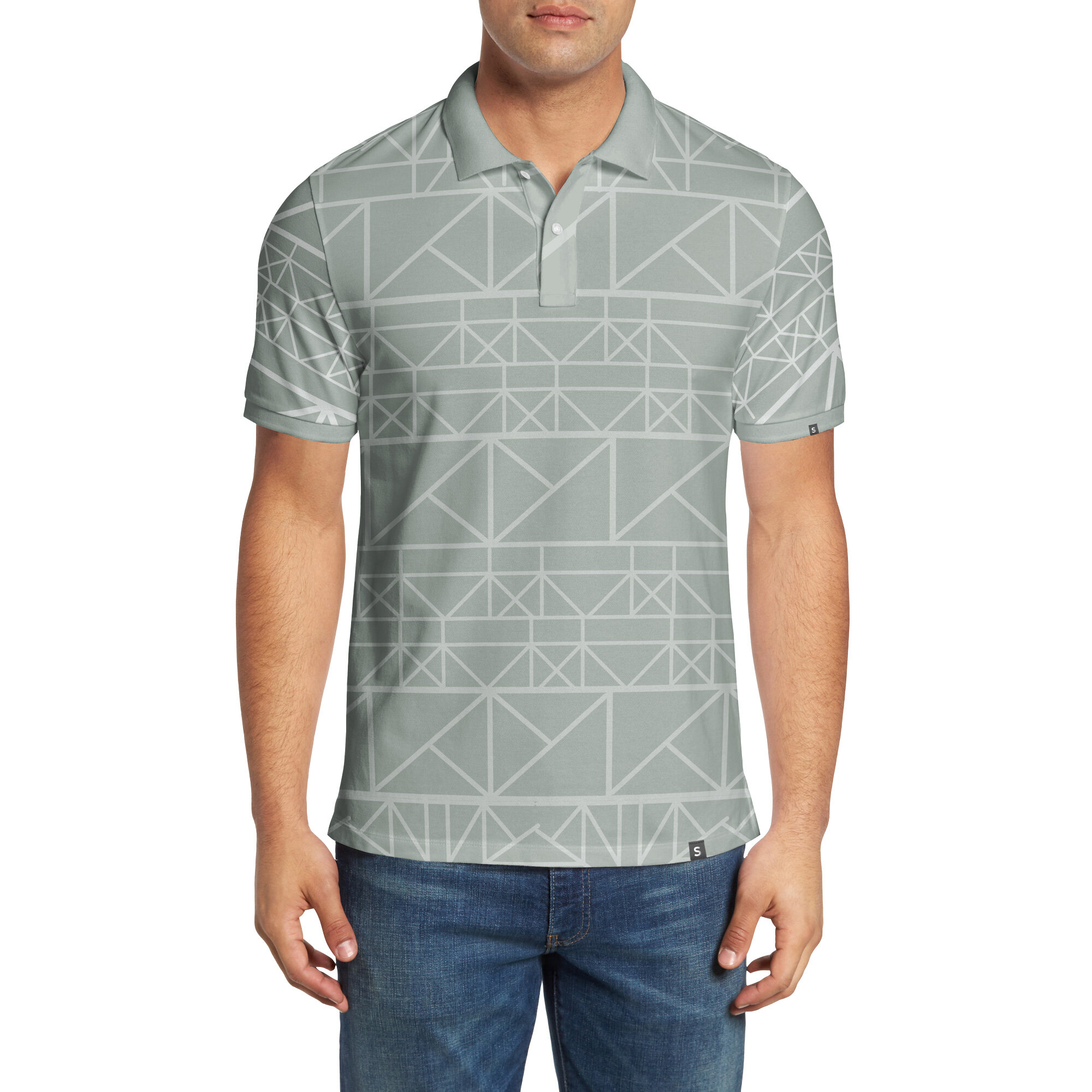
A pattern was created with the linework of the trees in the logo. The pattern could be used to layer into the brand for visual texture or to create an aloha shirt or office uniform.
04
BRAND VOICE
Messaging across the website and social media platforms were crafted to be simple, clear and create an experience for patients that felt easy and comfortable.
05
BRAND ACTIVATION
Daniel was set up with custom instagram templates to be able to create his own content and be more accessible to patients. As one of the goals of his brand and business is to connect with his community on a more personal level—ideas included an “Ask Dr. Lim” Q&A on instagram as well as a special presentations and tips for young athletes.
We also equipped Daniel with a logo embosser and branded stationery that he could use to write personal messages to patients or staff.
“Our work with Ashley has been the best investment in launching our business. Working with her has not only produced an excellent, professional appearance to the brand—but it has focused our vision and plans going forward. I highly recommend her as a professional partner, advisor and resource in realizing a brand.”
—DANIEL LIM, M.D.
Orthopedic Surgeon


