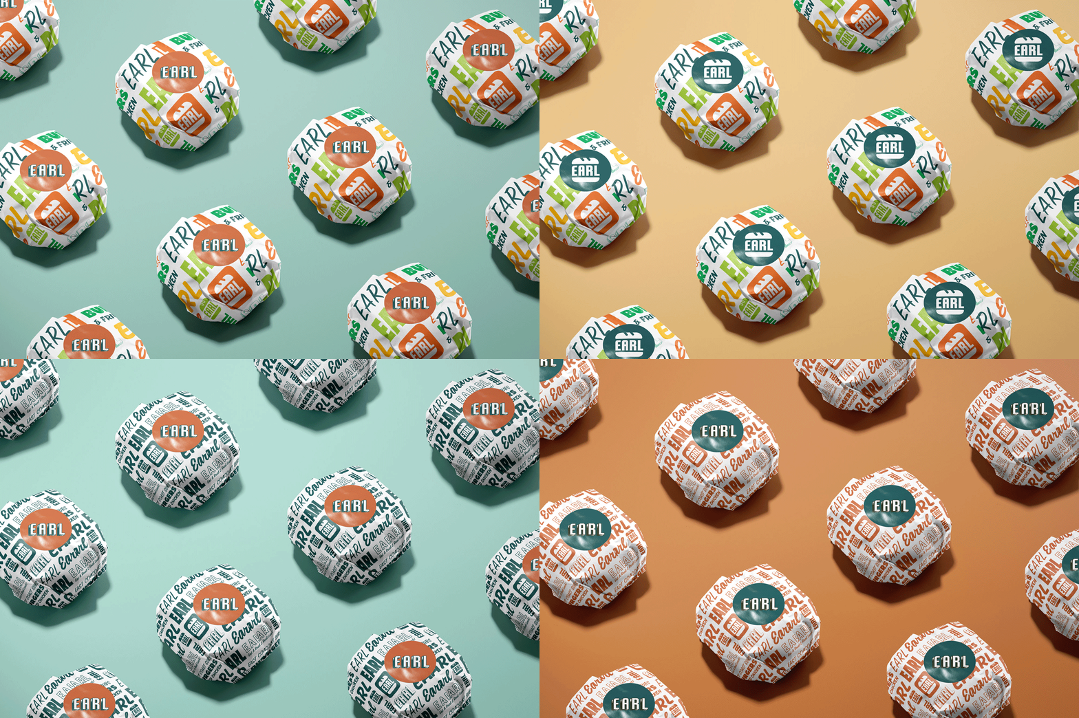
—EARL
A Real Brand for an Retro Sub Shop
East Coast transplant and foodpreneur Justin had grown his small local sub shop to two locations in Hawai’i. His brand consisted of a logo and four colors and was ready for a real brand that better reflected his personality, roots and the no-fuss food he was becoming known for.



01
BRAND STORY
EARL stands for Eat a Real Lunch and in a first-of-its-kind East Coast sub shop in Hawai’i serving up their unapologetic take on classic subs and no-frills food. They were looking for a rebrand that leveraged the equity in their iconic color palette but with a more intentional, bold and retro-inspired refresh.

02
THE LOGO

03
DESIGN ELEMENTS


04
BRAND VOICE

05
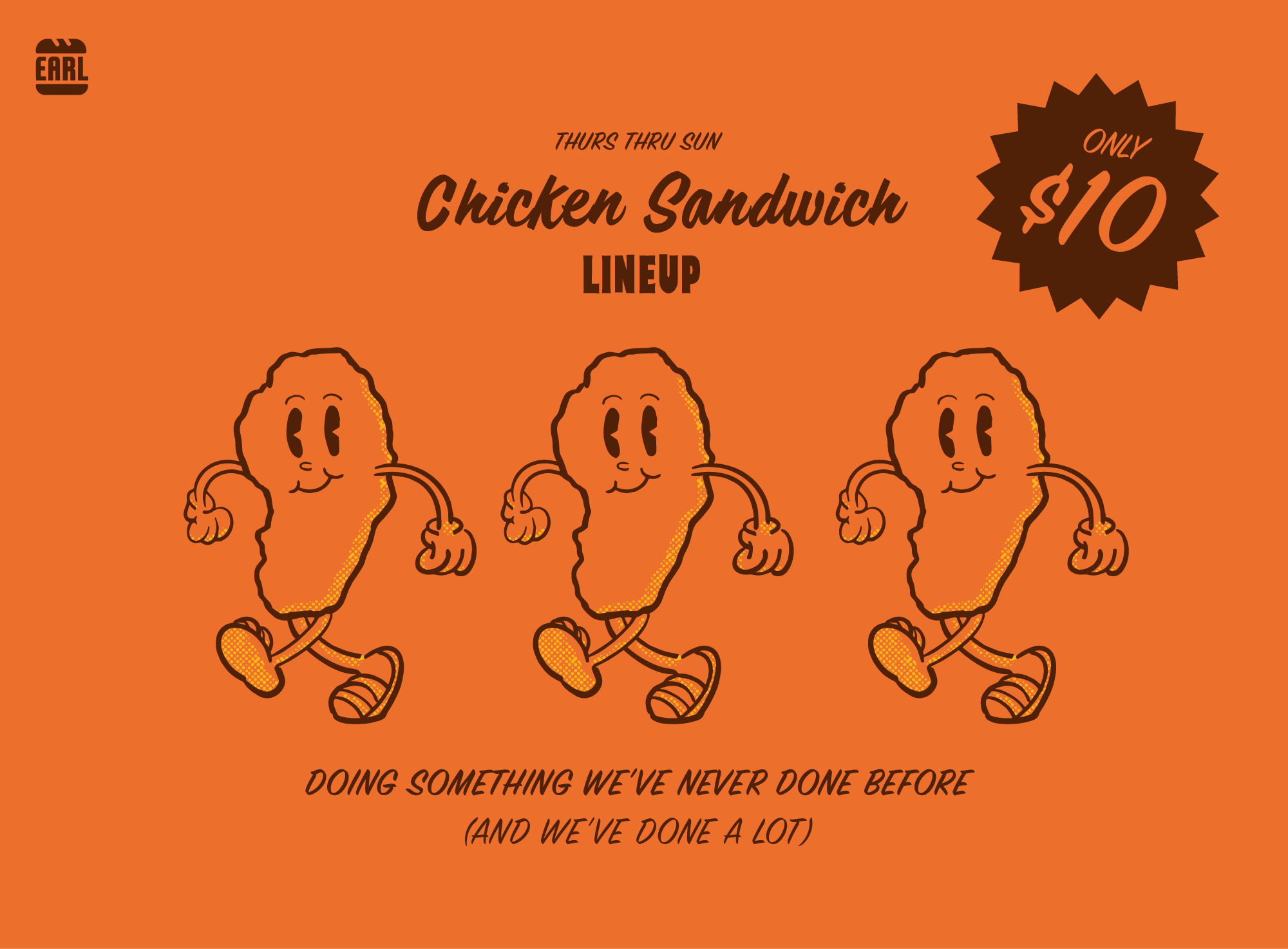
BRAND ACTIVATION


