—LIFEHOUSE REALTY
An Exciting Rebrand for an Established Realtor
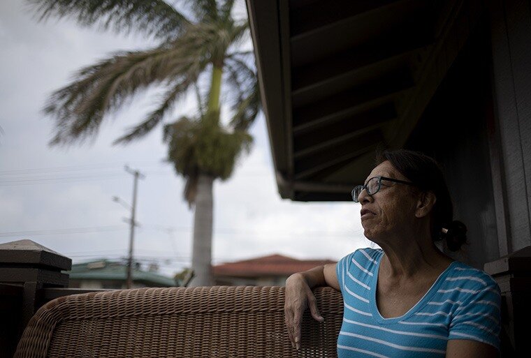
Real Estate power couple Fran and Shawn have been in the real estate and property management business in Hawaii for over a decade. With plans to expand their already-successful businesses, they felt it was time for a new name and new brand that could evolve with them.


01
BRAND STORY
The Lifehouse Brand is built on Fran and Shawn's deep understanding of what real estate really means in the lives of the local people in Hawai'i. It reflects the ease, simplicity and best-in-class way that they help real people and families navigate a fast-paced and high-demand market.
02
THE LOGO
We created a clean, modern monogram that doubled as a symbolic logoicon.
It was also important that the logo create a flexible sub-branding system.

03
DESIGN ELEMENTS
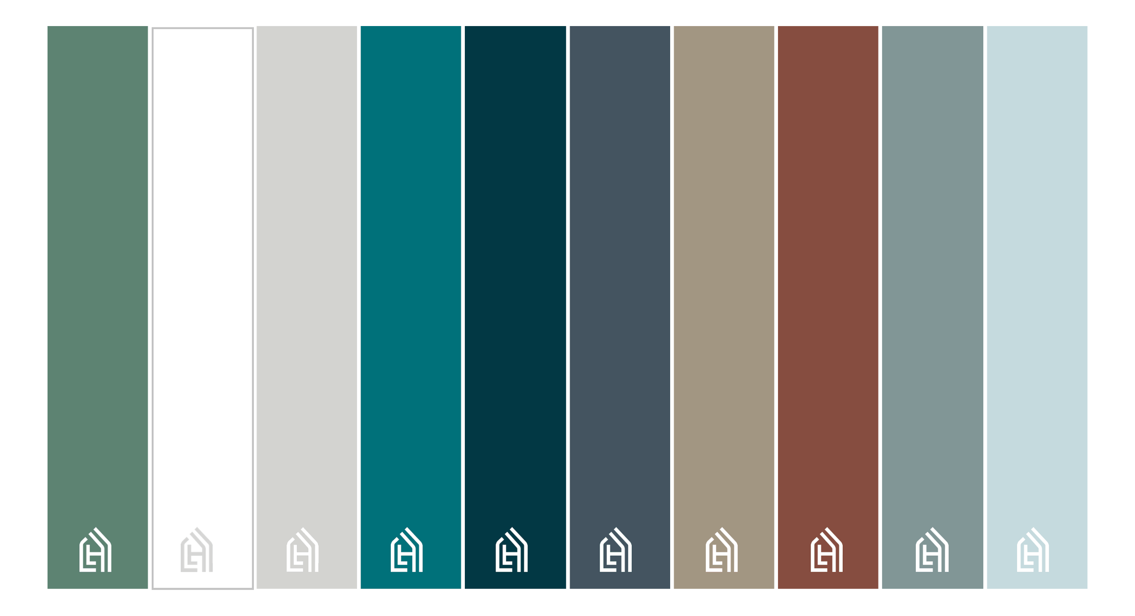
An earthy palette inspired by Hawai’i— from its red soil upon which homes are built to the nature that defines their neighborhoods.
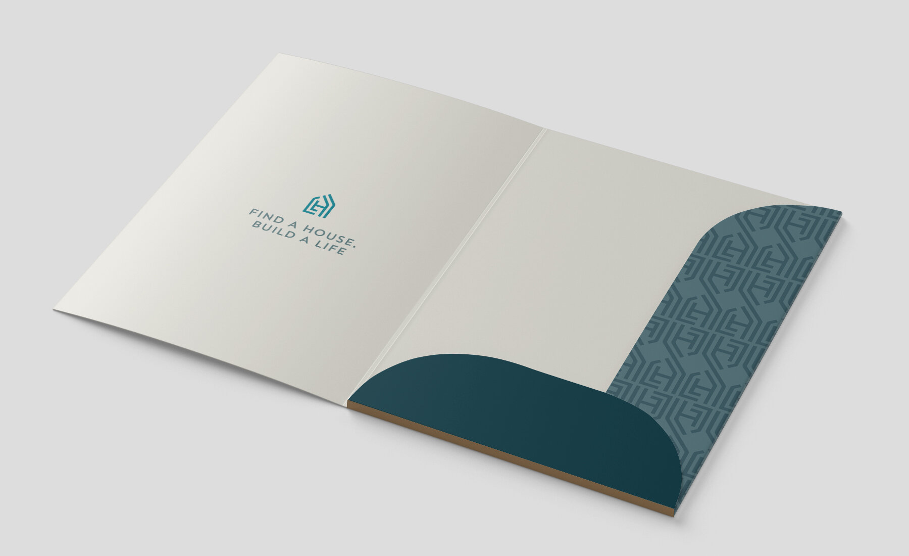
To connect to Hawai’i, we created a pattern inspired by the patterns of kapa sleeping mats that represent home as Hawaiians were a seafaring people, thus the ability to sleep in the same place multiple nights was seen as a blessing from the gods.
A modern humanist sans serif typeface paired with complimentary sans serif and legible body type.

04
BRAND VOICE
The tagline Find a House, Build a Life captured everything Fran and Shawn wanted their clients to feel—that working with them would be simple, easy and that they truly understand what real estate means in the story of their lives.
This personal connection to Fran and Shawn would also come to life through their newly created instagram account and a diversity of content that highlighted their local roots and expertise.

05
BRAND ACTIVATION
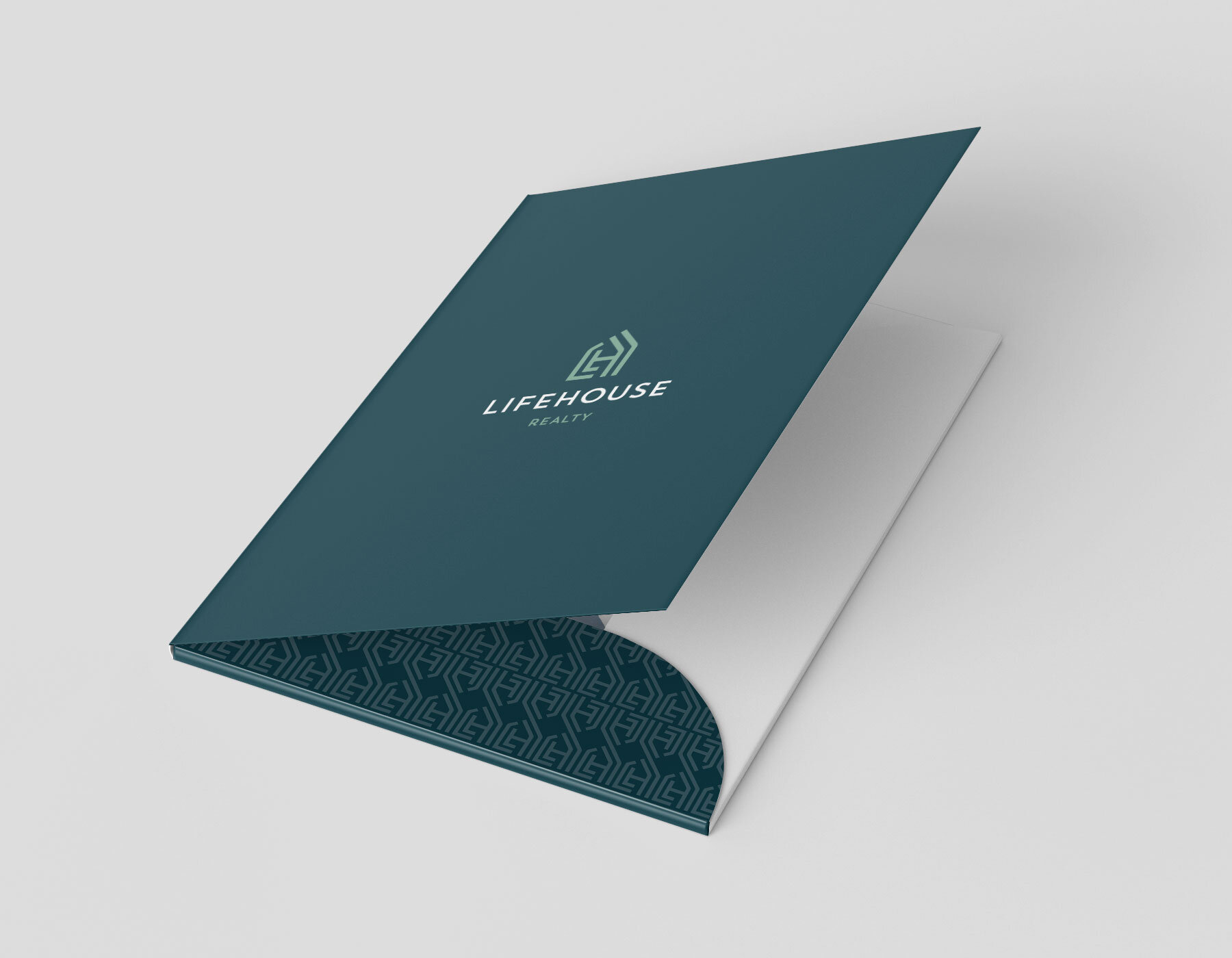
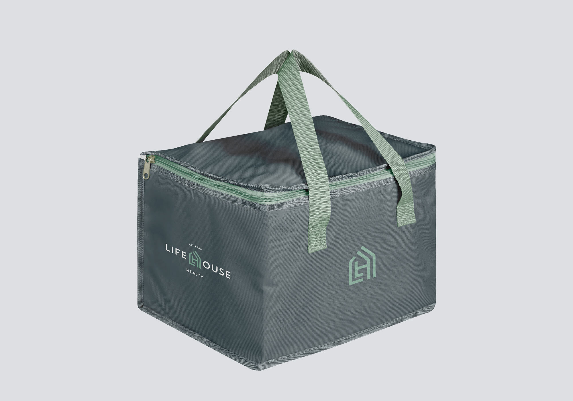
The branded experience we created follows the customer from first sight (building and real estate signage) through the process (client folders to house important documents) to closing (client gifts).



—FRAN VILLARMIA-KAHAWAI
Principal Broker
