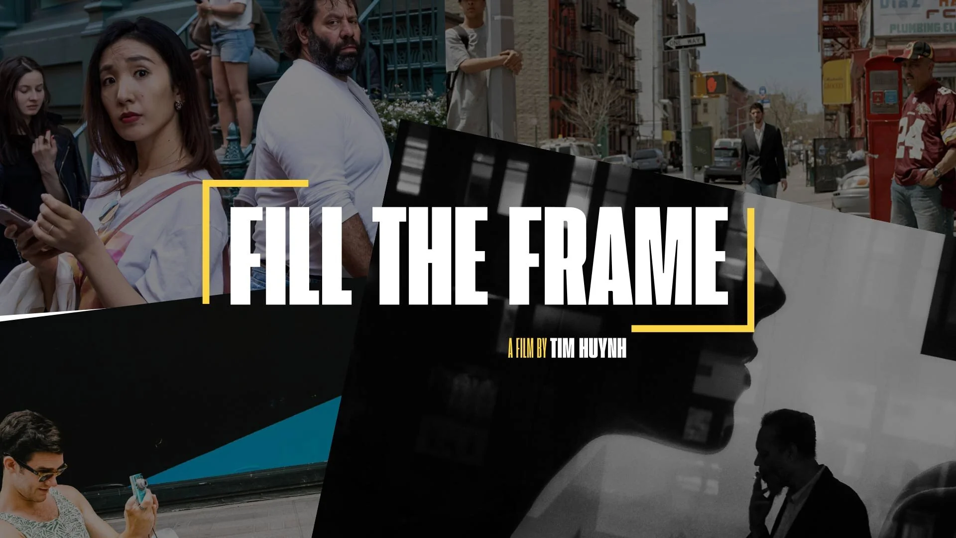
—FILL THE FRAME FILM
A Bold Brand for a Burgeoning Filmmaker
Director Tim Huynh reached out for help creating posters for his latest documentary, Fill the Frame which follows eight contemporary New York street photographers and why the art inspires them.
We worked together to create a brand that captured the film’s personality and create a unique identity that would stand out and help raise the funds needed to launch the film.


01
BRAND STORY
The Fill the Frame brand embodies the bold style of street photography and the film’s star-studded cast.

02
THE LOGO
The Frame is in the Name
The letterforms appropriately fill the frame just as the title suggests. To further echo the name, a geometric framing device adds eye-catching color and creates an easy-to-use visual motif for use in the film. Animated in various ways, this highly flexible lock up allows for flexible taglines and orientations.
03
DESIGN ELEMENTS
The bright yellow color found in street signs is stimulating, bold and energizes the black and white palette.


04
BRAND VOICE
Loud, bold typography colors the film’s messaging, allowing it to stand out in a crowd of films. We used handset type to create a highly-identifiable style weaved throughout the film and on promotional materials.
05
BRAND ACTIVATION
Promotional posters and the website carry the film’s minimal, edgy and bold personality throughout the experience.


"Ashley helped capture the look and feel I was looking for and gave us an identity that separated us from other documentaries made on street photography. Her work on our website and movie posters took our film to the next level and made for a successful Kickstarter campaign to help fund and complete our film!"
—TIM HUYNH
Filmmaker + Street Photographer


